How Columbus went from a Civil War bee mascot to a corporate star crest, and why the Blue Jackets’ original identity had way more personality.
It’s one of those things you can look at for years without actually seeing.
The Columbus Blue Jackets enter the NHL in 2000. You see the name constantly. You see the logos, the jerseys, the branding. Maybe you even remember the early mascot era. But then one day it clicks: Blue Jackets doesn’t just sound military. It literally refers to Union Army soldiers from the American Civil War.
And once you see it, you can’t unsee it.
It reframes the entire aesthetic of the franchise. What first reads as a generic patriotic sports name suddenly becomes hyper-specific historical branding. It’s not just Americana. It’s Civil War Union symbolism packaged as a modern NHL identity.
That delayed recognition is part of what makes the Blue Jackets such a fascinating case study in sports branding. The history was always there. Most of us just weren’t looking closely enough.
Name Origins and Civil War Context
The team’s name is directly tied to Ohio’s role in the Civil War. Union soldiers were commonly referred to as “Blue Jackets” because of the navy blue coats that were standard issue for Union Army uniforms. Ohio, firmly aligned with the Union, played a significant role in the war by supplying large numbers of troops, officers, and logistical support. The state produced several prominent Union generals and contributed hundreds of thousands of soldiers to the overall war effort.
When Columbus was awarded an NHL expansion franchise in 2000, the ownership group sought a name that would reflect both regional identity and historical pride. “Blue Jackets” satisfied multiple objectives at once. It evoked military heritage, highlighted Ohio’s historical ties to the Union cause, carried clear patriotic symbolism, and stood out within the broader NHL naming landscape.
Unlike abstract animal mascots or more corporate-sounding brand constructions, the name anchored the franchise in a specific historical narrative. It functioned as civic branding just as much as sports branding.
However, the execution of that identity, particularly in its early visual form, took an unexpected turn.
The Early Logo and Mascot Aesthetic
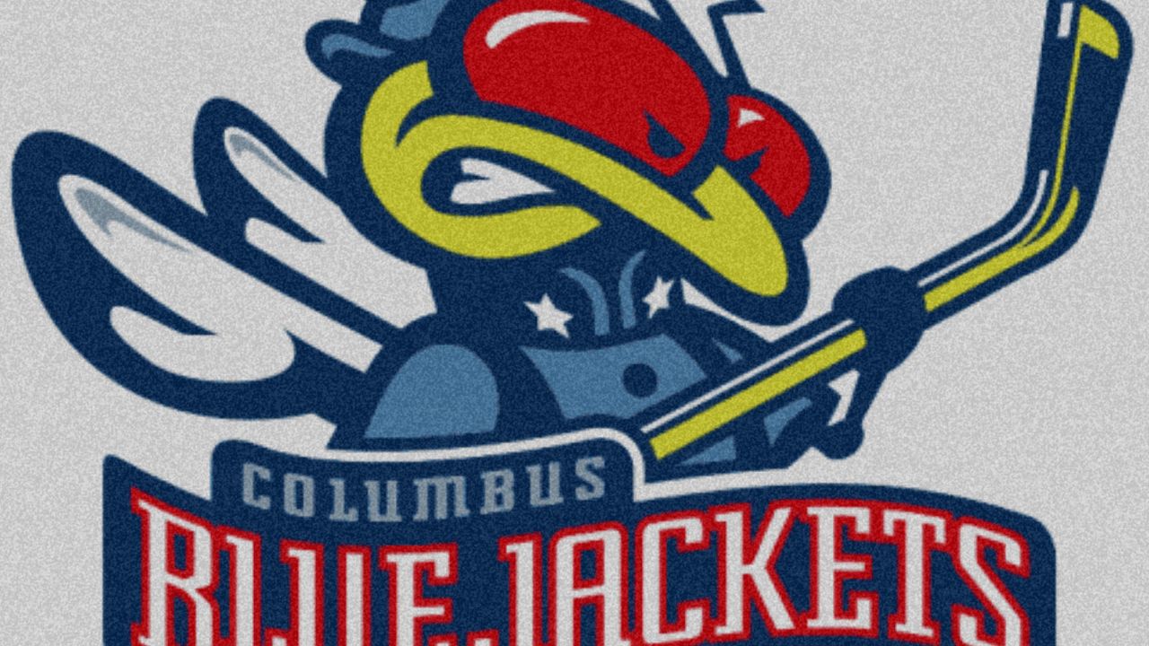
Early Blue Jackets branding did not lean solely into military seriousness. Instead, it blended Civil War imagery with the visual language of a cartoon mascot.
The centerpiece of this approach was “Stinger,” a bright green insect character frequently associated with alternate logos and promotional materials. At first glance, the design read like standard early-2000s expansion team branding: colorful, kid-friendly, and heavily oriented toward merchandising.
However, the details were doing more symbolic work than many observers initially realized.
In some iterations, the insect character wore a Union Army–style cap. This is where the visual pun became fully apparent. The name “Blue Jackets” referenced Civil War soldiers, while the insect evoked the idea of a yellow jacket, a stinging wasp commonly used as a sports mascot archetype.
The result was a dual-meaning identity in which the franchise simultaneously referenced 19th-century military history and contemporary sports mascot tradition.
This kind of layered branding is relatively rare in major professional sports. Most franchises choose a single tonal direction, either emphasizing historical reverence or embracing cartoonish accessibility.
Columbus attempted to do both at once.
The outcome was a logo system that could register as either clever or confusing, depending on how closely one examined the symbolism embedded within it.
Symbolism and Cultural Contrast
That duality becomes more interesting when you zoom out to the broader landscape of American sports symbolism.
Civil War imagery in athletics isn’t uncommon. But it tends to skew heavily toward Confederate or “Rebel” iconography, particularly at the college level. For decades, Southern schools used Confederate mascots, flags, and military references as core identity markers.
By contrast, Union symbolism appears far less frequently.
Which is striking when you consider the Union actually won the war.
The Blue Jackets stand out because they represent the Northern side of Civil War memory, reframed through modern patriotism rather than Lost Cause mythology. It’s a Union identity stripped of political controversy and repackaged as regional pride.
There are a few adjacent examples. The New York Yankees draw their name from a term historically applied to Union soldiers and Northern Americans more broadly. But even there, the Civil War connection feels indirect compared to Columbus’s explicit military uniform reference.
That rarity makes the Blue Jackets branding feel novel. It’s Civil War symbolism, but not the kind most commonly mythologized in U.S. sports culture.
And because it’s filtered through hockey, a league with a more international and less Civil War–obsessed audience, the historical meaning often flies under the radar.
The Modern Logo Shift
Over time, the franchise moved away from its more playful visual identity.
The current primary logo centers on a stylized star wrapped in the Ohio state flag, forming a “CBJ” crest. The insect mascot has been pushed to the margins, largely absent from the core branding system.
The tonal shift is immediate.
Where the early logos felt quirky and expansion-era experimental, the modern crest feels institutional. It resembles a military patch, government seal, or National Guard insignia more than a cartoon mascot emblem.
The Civil War symbolism remains, but it’s been streamlined into abstract patriotism. Flags, stars, and motion lines replace insects and character design.
From a branding perspective, it reflects maturation. Expansion teams often debut with bold, playful identities before settling into more traditional aesthetics.
But something is lost in the process.
The strange, layered humor of “a bee in a Union soldier hat” gives way to standardized pro sports seriousness. The brand becomes more legible, but less distinctive.
Franchise History
On the ice, the Blue Jackets’ history has been more modest than their branding ambition. As a franchise that entered the league as a 2000 expansion team, Columbus spent much of its early existence struggling to achieve consistent playoff relevance, and deep postseason runs were uncommon.
Two moments, however, stand out as exceptions. In 2019, Columbus swept the Tampa Bay Lightning, who had just completed one of the greatest regular seasons in NHL history. The series remains one of the most significant playoff upsets in modern hockey. The following year, during the pandemic-shortened postseason format, the Blue Jackets eliminated the Toronto Maple Leafs in the play-in round.
These flashes of success brought the franchise brief periods of national visibility, but sustained contention has remained elusive.
History You Don’t Notice Until You Do
What makes the Columbus Blue Jackets fascinating isn’t just their performance or market size. It’s the way their identity encodes history most fans don’t actively think about.
The name references Civil War soldiers. The early logos visualized that symbolism literally. The modern crest abstracts it into institutional patriotism.
All of it was always visible. But recognition often comes late, triggered by a logo detail or a passing conversation.
Sports branding works like cultural shorthand. It compresses regional memory, military heritage, and civic mythology into colors and symbols we consume casually.
Columbus is a rare case where that shorthand points explicitly to Union Civil War identity rather than the more common Confederate nostalgia embedded elsewhere in American sports culture.
And once you see that connection, the franchise stops looking like just another NHL team.
It starts looking like history hiding in plain sight.